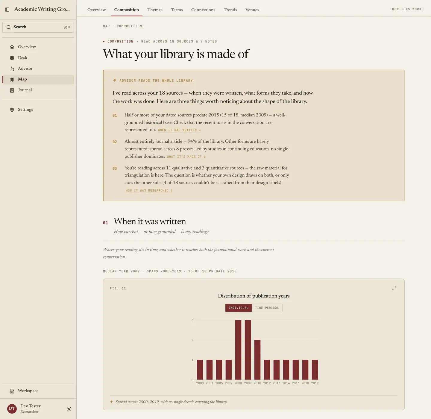
Composition answers four questions about your corpus in one scroll, covering when it was written, what it is made of, how it was researched, and where it comes from. A gold synthesis card reads the whole story first, then four numbered sections pair a chart with an observation, since no chart ships alone here on the grounds that a chart on its own is a Rorschach test. This tab catches the problems you cannot see from inside your own reading list, such as a literature review quietly ten years out of date, a methods chapter claiming breadth your sources do not have, or a corpus drawn entirely from one country. It is free and it uses no AI. The Composition tab: a synthesis card over the numbered sections covering when the library was written and what it is made of.

01 - When it was written

A publication-year histogram, with the median year, the span, and how much of your library predates 2015. The pre-2015 figure is the one that stings, because drifting toward work a decade old happens to everyone, since the papers everyone cites are the papers you collect, and it is also the first thing a committee notices. When that number runs high, the fix is a search restricted to the last five years rather than a rewrite. The span tells you something too, since a corpus clustered tightly in three years is following a moment while one spread across forty is tracking a tradition. Both are defensible, though neither is defensible by accident.

02 - What it’s made of

Source types, publishers, and how the mix has shifted over time. Type mix makes a claim about your field’s evidence base, so a corpus that is 90% journal articles reads as normal in the sciences and as a warning in the humanities, where books carry the argument. Heavy conference-paper weighting points either to a fast-moving computational field or to the fact that proceedings are free. Publisher spread stands in for how broadly you have searched, and a library concentrated in two publishers usually means one database.

03 - How it was researched

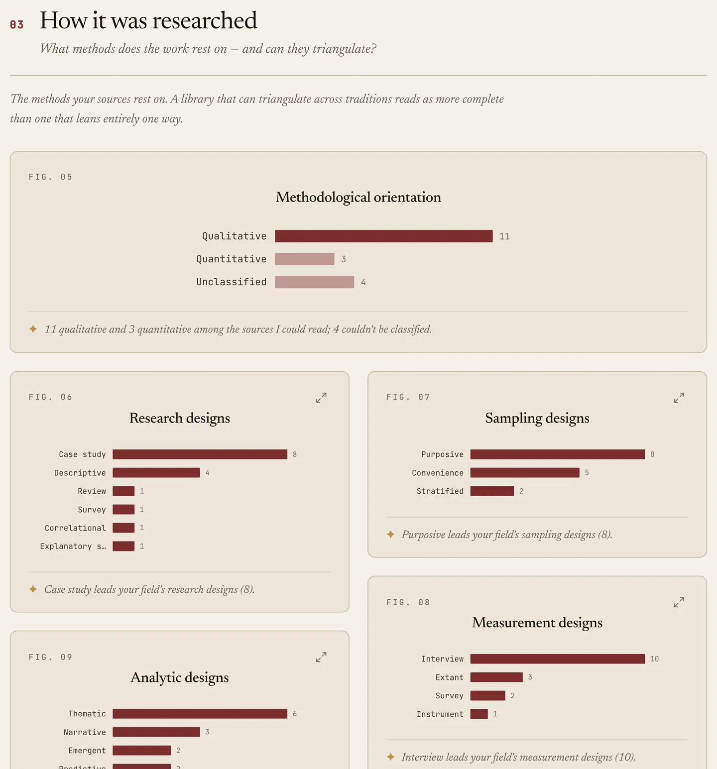
A qualitative, mixed and quantitative split, plus four design charts covering research, sampling, measurement and analytic design. All of it comes from the designs recorded on each source, described in Reading a source, so it is only as complete as what you have filled in, and sparse data gives a thin chart while the tab does not pretend otherwise. Composition section 03: a qualitative, quantitative and unclassified split, then charts of research, sampling, measurement and analytic designs. The reason to fill it in is that this section is the evidence behind the methods claims in your own thesis, since “the literature on this topic is dominated by cross-sectional survey designs” is a sentence you either assert or demonstrate, and this demonstrates it. It also shows where you can contribute, because in a field that is entirely quantitative a qualitative study is a gap rather than a deficiency. The split is a heuristic and the tab labels it as one, so do not quote it as a precise statistic.
04 - Where it comes from

Open-access split, author-affiliation countries and median length, enriched from OpenAlex. Affiliation geography is the uncomfortable one, because a handful of wealthy countries dominate most literatures and most reviews reproduce that without noticing. Seeing it is the precondition for either fixing it or acknowledging it, and acknowledging it in writing marks out a careful review. The open-access split is practical, telling you how much of your field a reader without library access could actually check.

What to do with it

Every section works the same way: find the imbalance, decide whether it is a finding or a flaw, then act. A flaw in your reading is a search to run, whereas a finding about the field belongs in your literature review, since “the literature is overwhelmingly cross-sectional and drawn from North American institutions” is a real contribution and this tab is where you get the confidence to write it down. Next: Themes.
Last modified on August 30, 2026